

Updating one of MLB’s most iconic identities.
—
RARE Design
Rodney Richardson - Principal/CD
Marie Siegfried - Account Director
Cody Bass - Designer
Ben Barnes - Designer
Brian Bollig - Designer
Jeremy Nelson - Designer
A new era for the Brewers
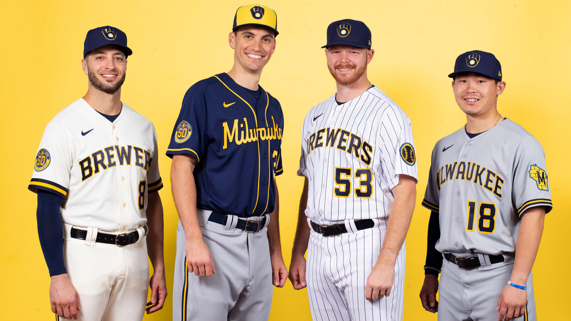
The Milwaukee Brewers approached RARE Design with the desire to revitalize the brand for their upcoming 50th anniversary in 2020. After merging the beloved 70’s ‘ball-in-glove’ logo with their 2000’s look, the brand felt like a mashup of different generations with no clear identity. Having undergone multiple rebrands during their 5 decades of play, the team was unsure of how to best move forward into the new era of Brewers baseball.
Influenced by the Cream City’s rich industrial history, we developed a brand that streamlined and elevated the Brewer’s iconic ‘ball-in-glove’ logo to it’s rightful place and built a system of marks, fresh and refreshed, that tell the true story of the Brewers.
I provided many different versions of the ‘ball-in-glove’ logo, ranging from subtle spacing clean-ups of the original to more modern, industrial takes. I also helped develop the font inspired by Milwaukee’s industrial architecture, and then created the complimentary Milwaukee script featured on the team’s Navy alt jersey. We explored a wide range of secondary logos for the team, ultimately landing on the wheat ball that is on the sleeve of the cream home and pinstripe alt uniforms.

![MB_System2[sq].jpg](https://images.squarespace-cdn.com/content/v1/5f9259d07d34f32c4ab8cb24/1603855916391-NO0IVNH5P3H3ZWJ98Q5M/MB_System2%5Bsq%5D.jpg)
![MB_System1[sq].jpg](https://images.squarespace-cdn.com/content/v1/5f9259d07d34f32c4ab8cb24/1603855899008-MWHZRR4WYPJ7DX7AM67S/MB_System1%5Bsq%5D.jpg)


![MB_System3[sq].jpg](https://images.squarespace-cdn.com/content/v1/5f9259d07d34f32c4ab8cb24/1603856027899-FV5LC6EFE0Q2Z8950R1G/MB_System3%5Bsq%5D.jpg)
![MB_System4[sq].jpg](https://images.squarespace-cdn.com/content/v1/5f9259d07d34f32c4ab8cb24/1603856062968-SLC6KDODGWU9BIMLVQEM/MB_System4%5Bsq%5D.jpg)


