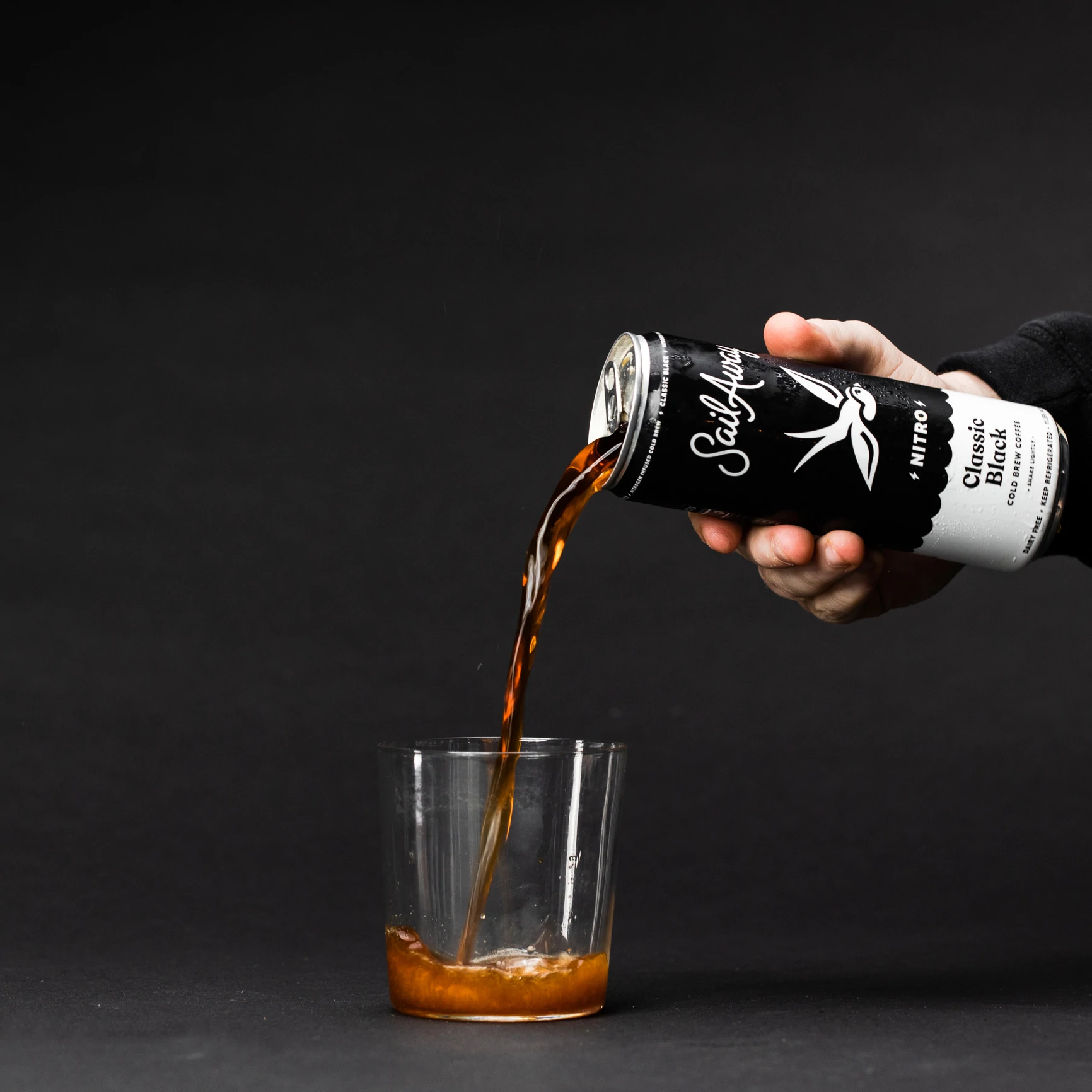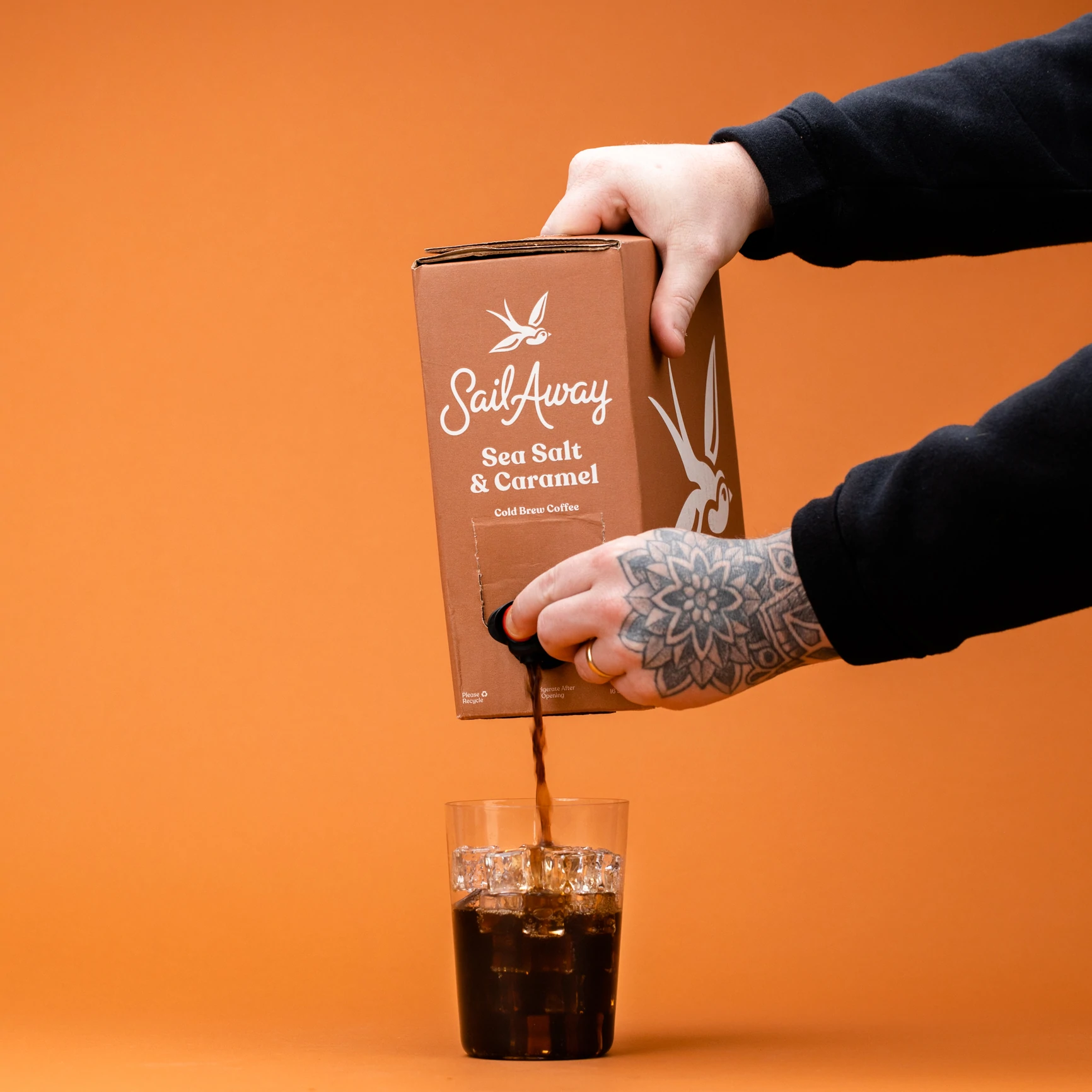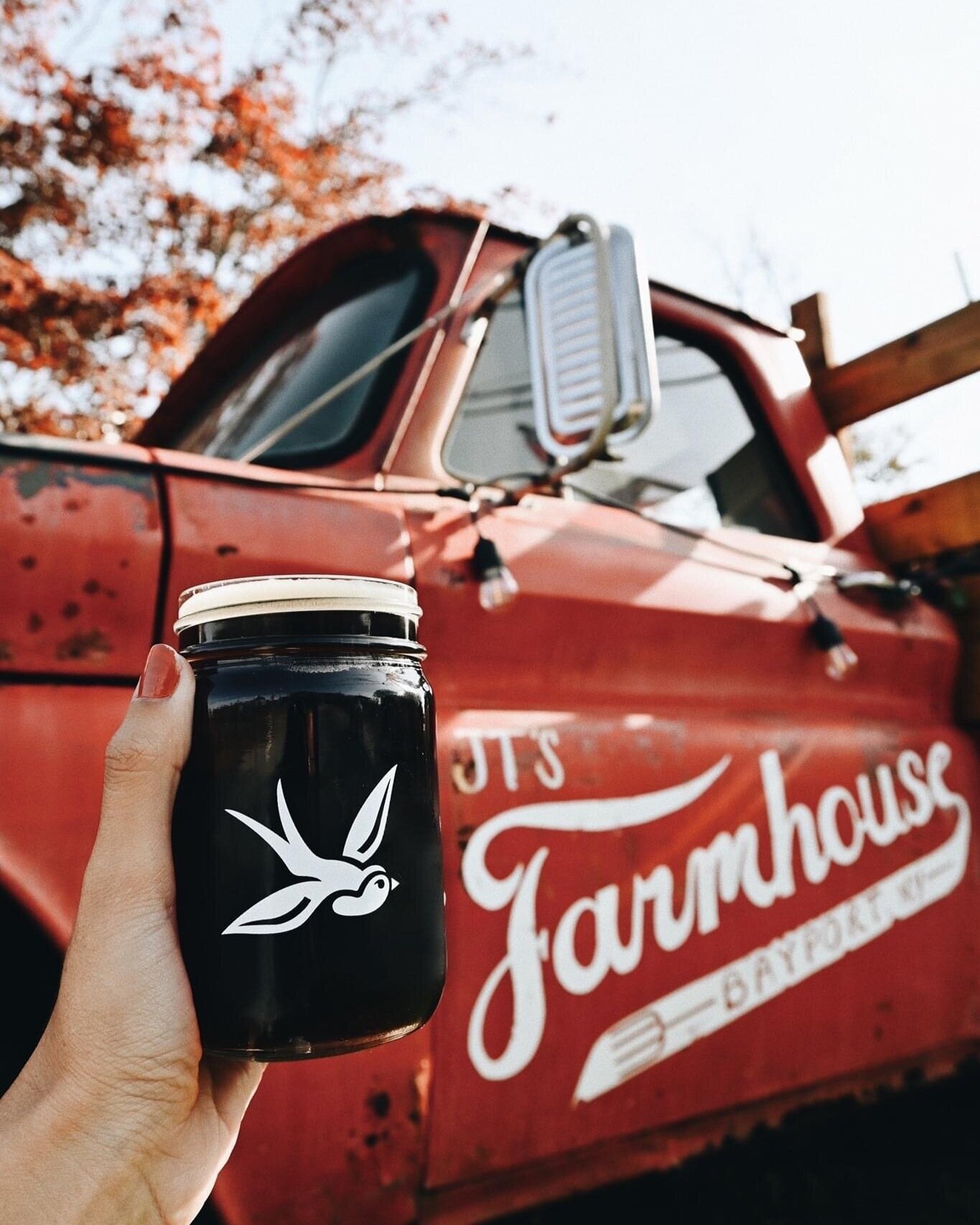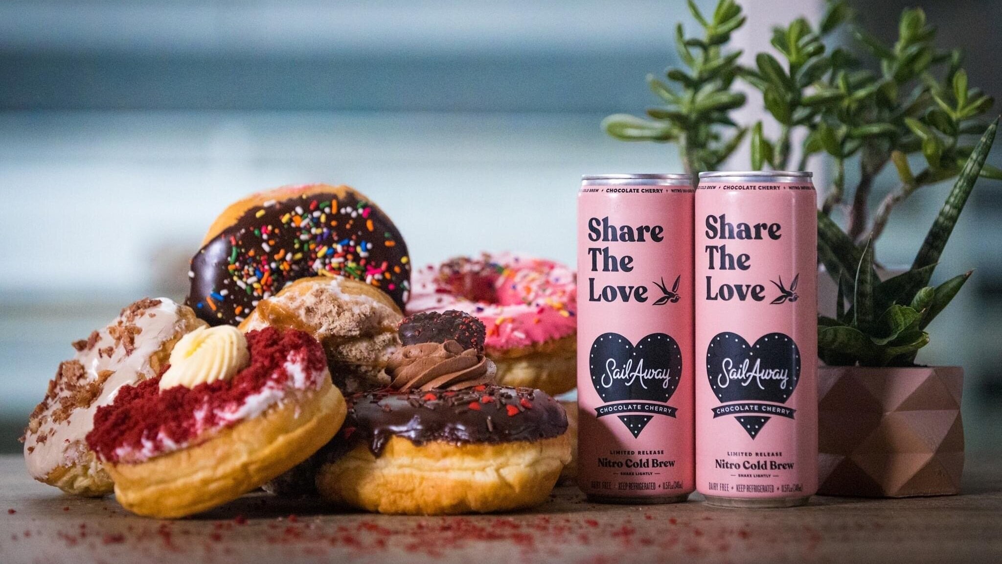
Refreshing Long Island’s cold brew coffee company.
—

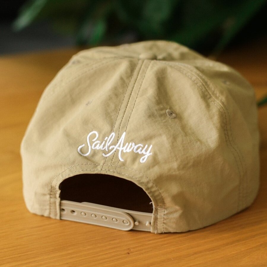
Script & swallow — Take 2
It’s not often that you get to re-approach a project you originally designed in college and fix all of the little things that bother you, but that’s what happened here. The guys from Sail Away originally came to me back in 2015 wanting a brand inspired by their years traveling as touring musicians with a little tattoo influence mixed in, but after 5 years we felt the brand could use a refresh.
I revised the script word mark by adding some much needed kerning, straightening the baseline, and finding just the right balance of wonkiness to take it from ‘amateur noodle-y script’ to ‘timeless hand-lettered logo’. The new-and-improved swallow icon is simpler & bolder to match the refined new look of the brand. Their internal team did a great job of subtly updating the packaging & can art we originally made to match the new logo, creating a cohesive look and feel for this Long Island staple.