Giving Nashville’s Minor League team a Major League look.
—
RARE Design
Rodney Richardson - Principal/CD
Marie Siegfried - Account Director
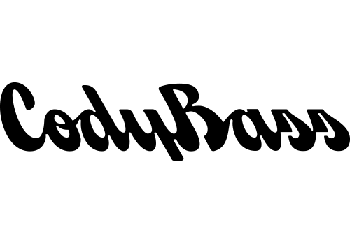
Cody Bass - Designer
Ben Barnes - Designer
Brian Bollig - Designer
Jeremy Nelson - Designer

Remastering Music City baseball
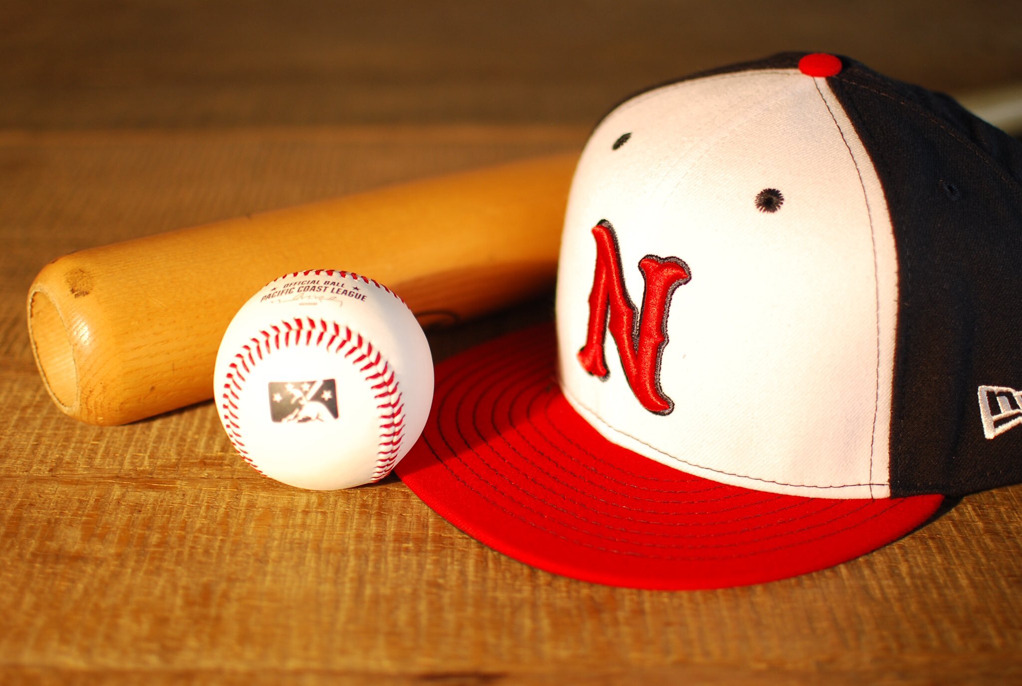
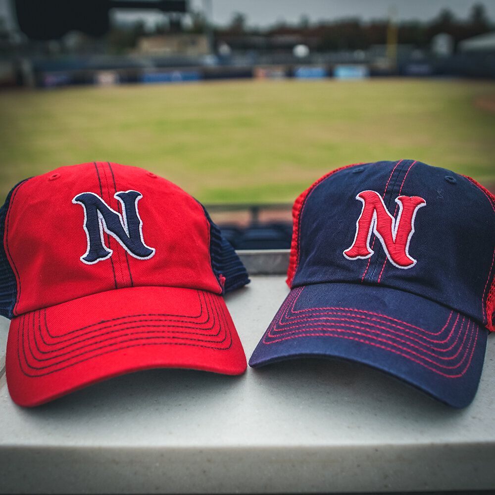
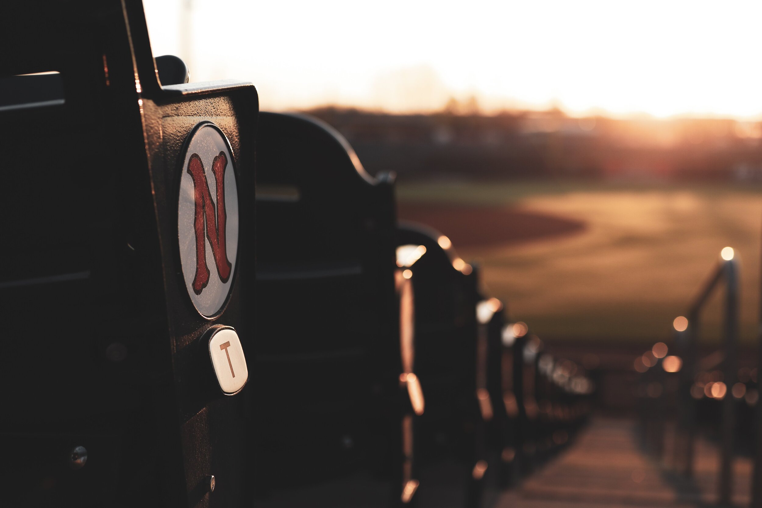
The Nashville Sounds came to RARE Design in 2018 wanting an update to their brand that would separate them from the pack. While many Minor League Baseball teams embrace a fun-forward look to their branding, that approach never really resonated with the Sounds. As the city’s only professional baseball team, the Minor League club wanted a Major League look to appeal to Nashville’s growing young professional population.
We tapped into the ‘modern vintage’ aesthetic of the Music City by referencing musical motifs, classic baseball styling, & woodblock typography from gig posters past to create a brand that felt both straight from the majors & uniquely Nashville.
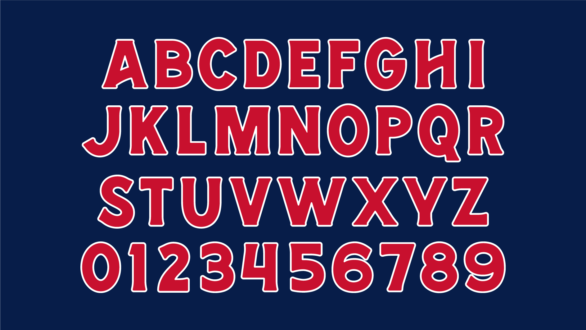
I created a custom display font for the team to use in logos, on uniforms, & marketing materials that served as the base for the teams overall aesthetic. I also developed two hand-lettered script logos featuring the team’s name and city to compliment the timeless baseball look we were striving for.


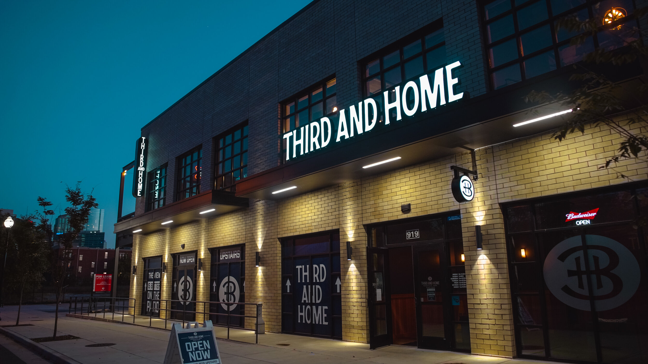
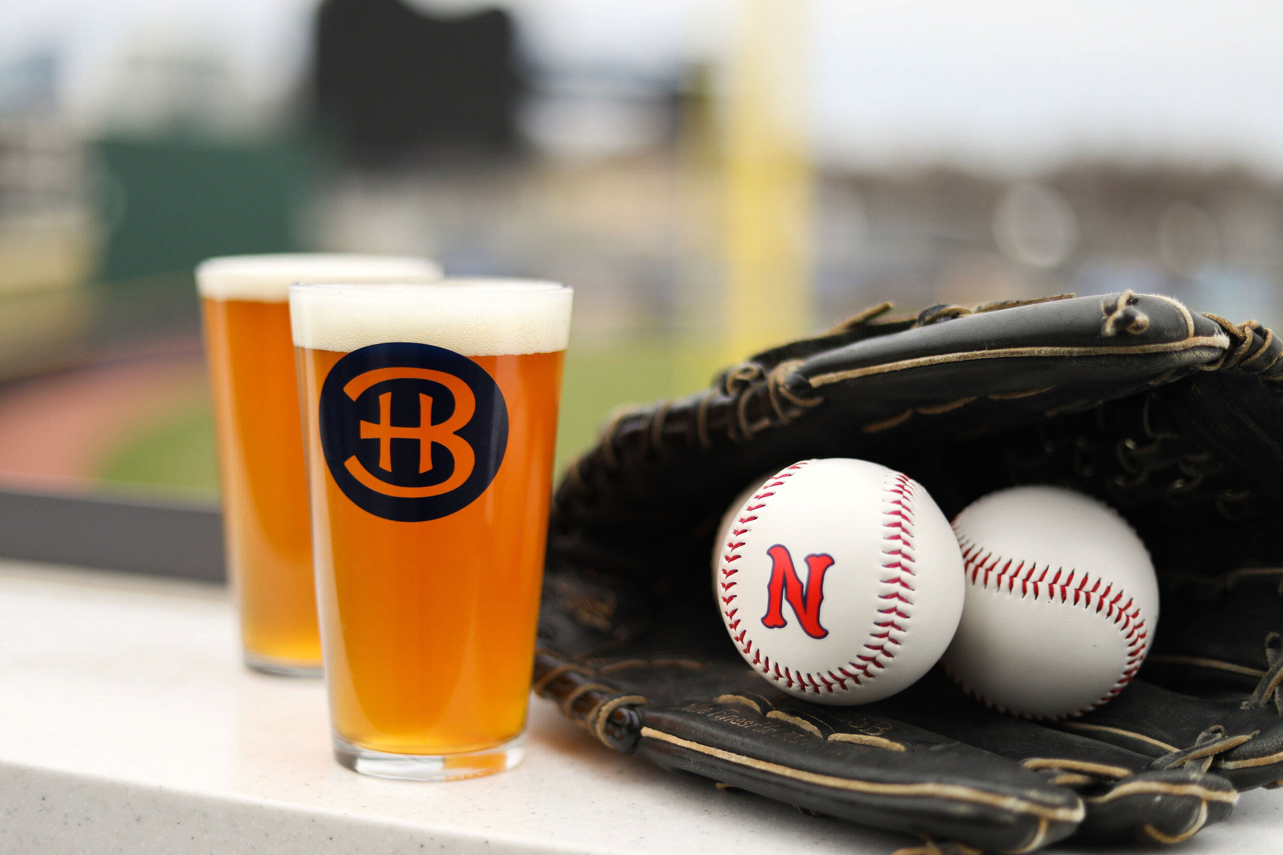
Third & Home
After the Sounds project wrapped, RARE was given the opportunity to name and brand the new restaurant & bar coming to the Sounds’ park. Referencing its location on N. Third Ave in Nashville, ‘Third & Home’ felt like a winner for the space that also overlooks the stretch of field from third base to home plate. Building off of the modern vintage aesthetic we established with the Sounds, we created a look that felt cohesive with the team’s branding but unique enough to stand on its own.
I developed the custom logotype & monogram logo and then carried the look over to a few secondary lockups and logos to create a cohesive system of marks for the restaurant to use on merchandise and marketing materials.